Accessibility — it's the foundation you build first
Digital standards for healthcare systems that work for patients under stress, professionals under pressure, and institutions under budget constraints.
Industry context
Medical institutions face unique communication challenges that most digital agencies misunderstand:
- Accessibility theater
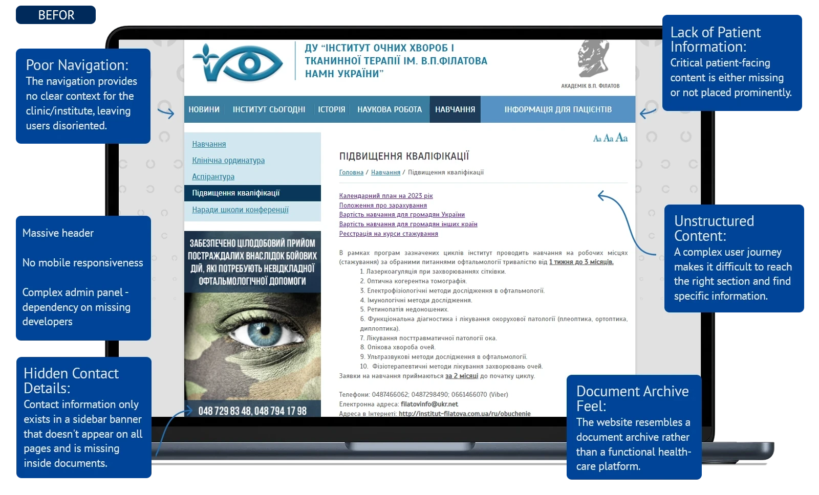
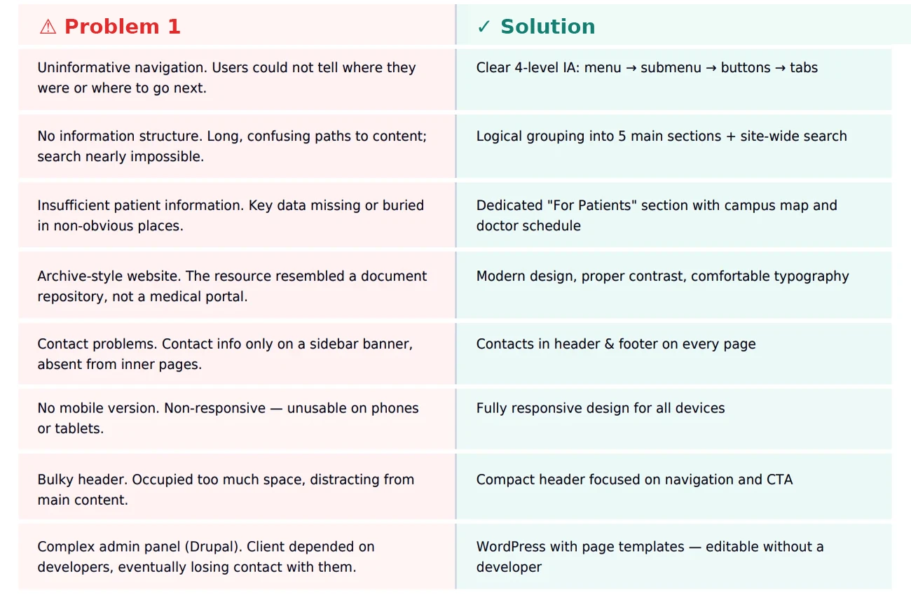
Many medical sites add complex 'accessibility plugins' with 15+ settings that vision-impaired users can't navigate. Real accessibility is built-in contrast, readable fonts, and one-click simplicity.
- Multi-audience chaos
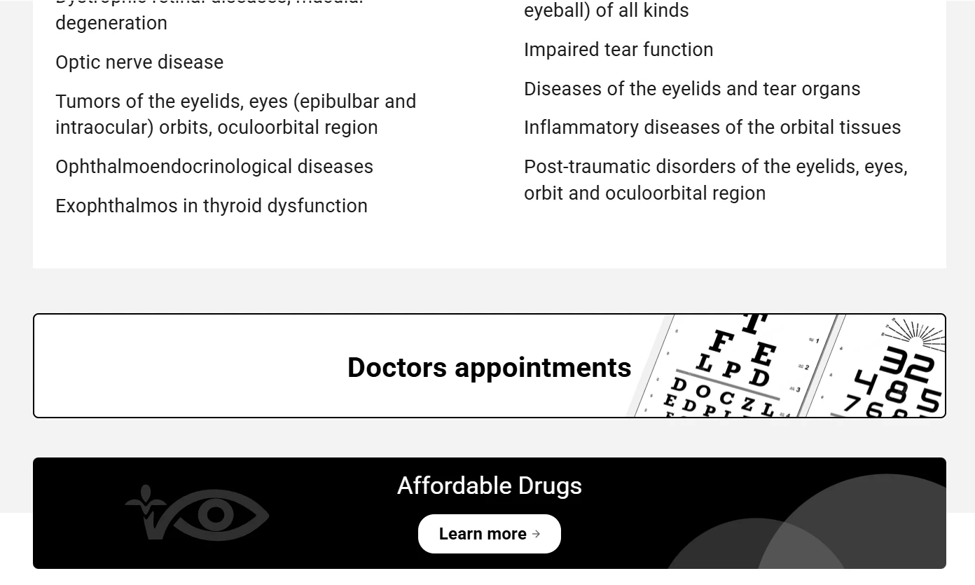
Hospitals serve patients seeking treatment, professionals needing protocols, and researchers publishing science. Most sites mix everything into one confusing structure.
- Budget vs. reality gap
Government healthcare facilities face massive user loads and complex needs, but limited budgets. Standard 'build everything custom' approaches don't scale.
Strategic Approach
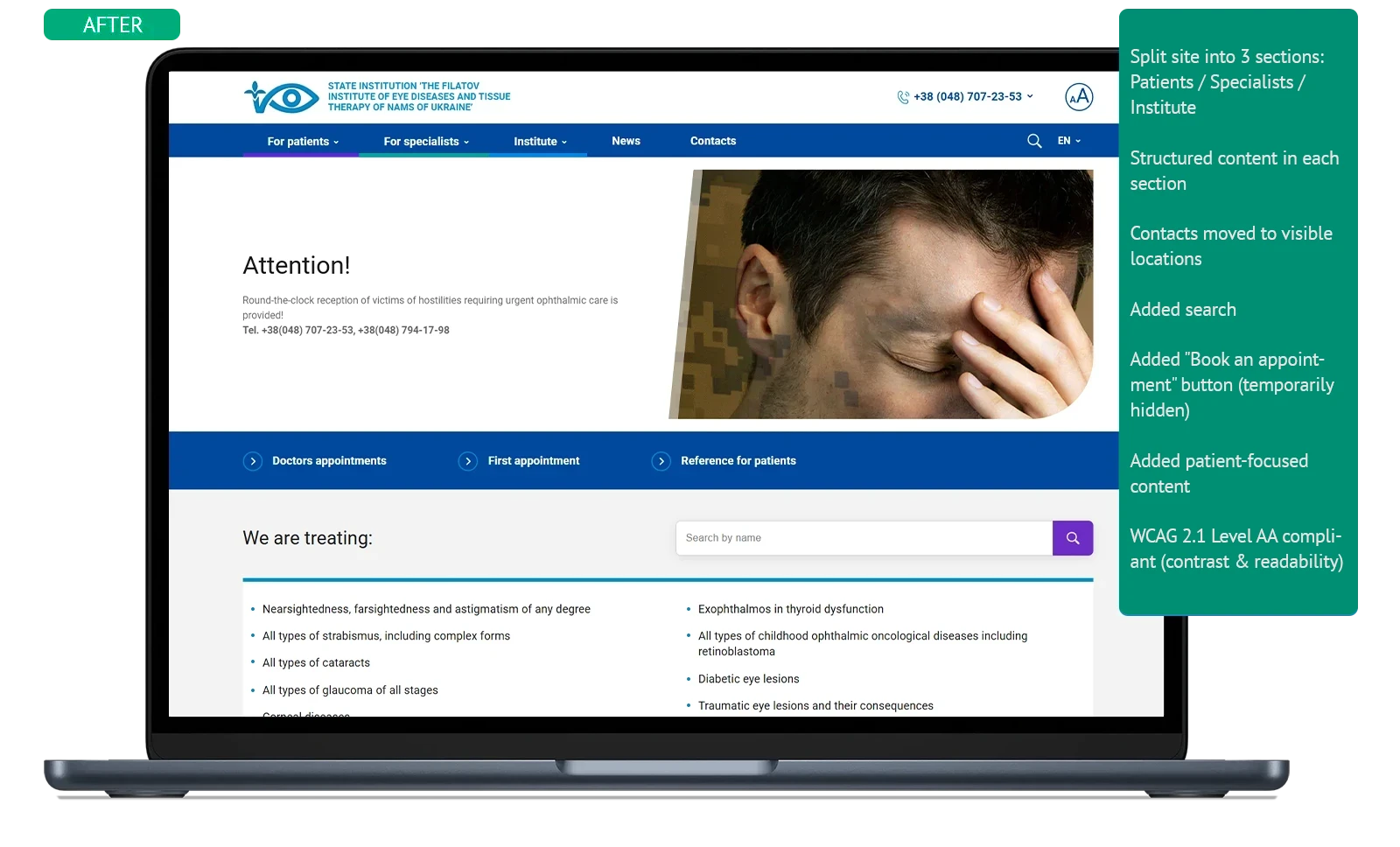
Accessibility First, Not Bolted-On
We design contrast, readability, and clear hierarchy from day one. Accessibility mode is one button (Aa), not fifteen settings a blind person can't find.
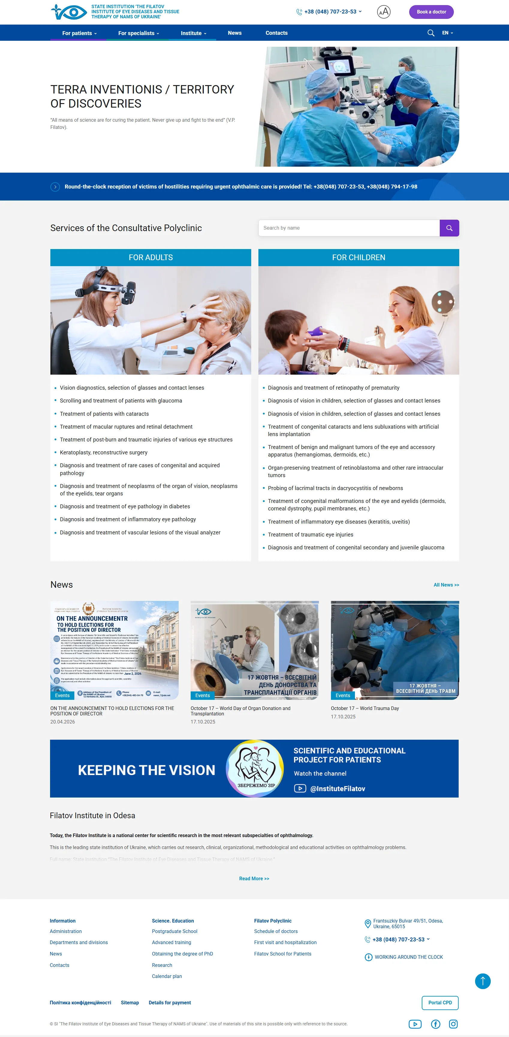
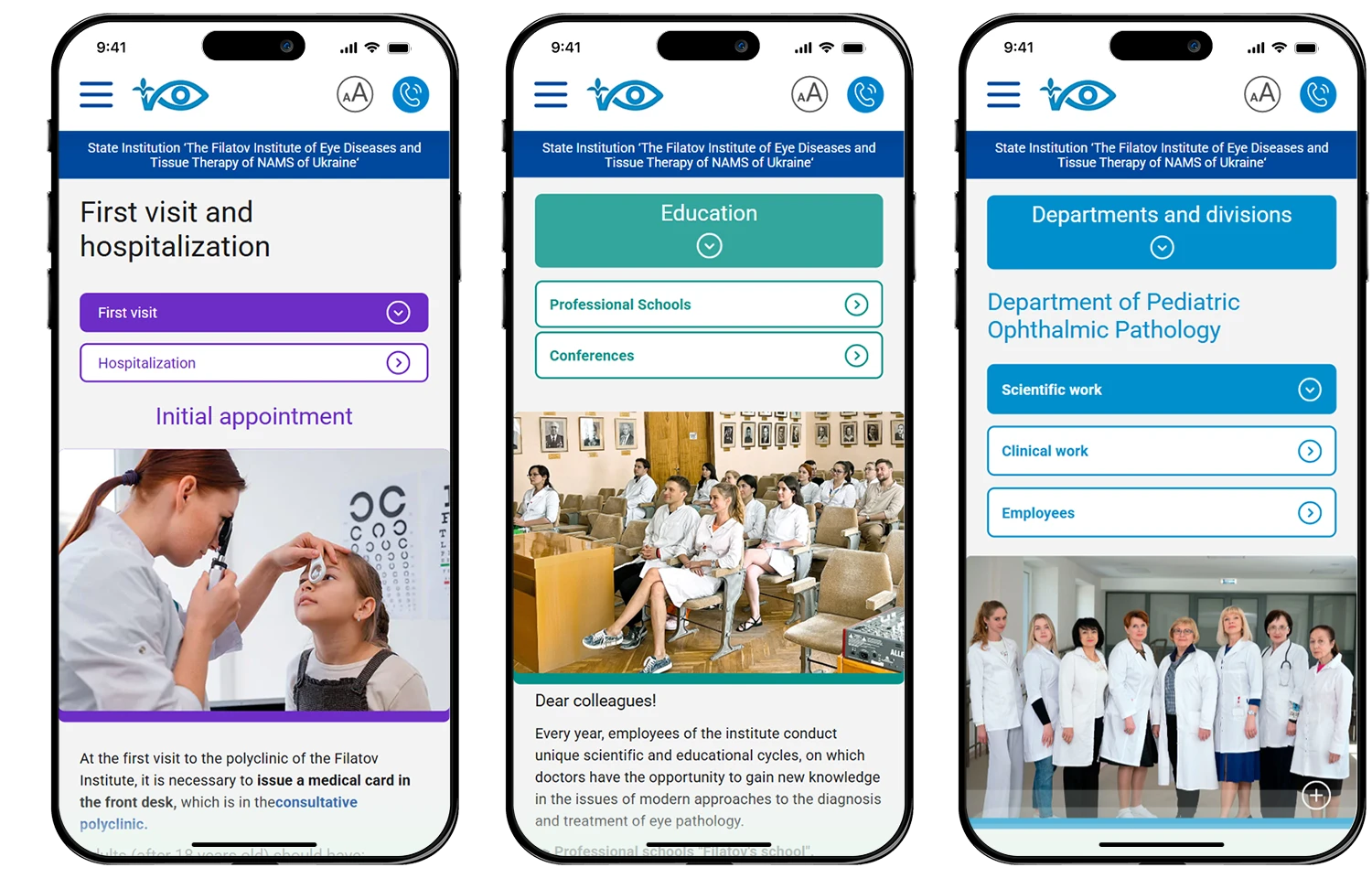
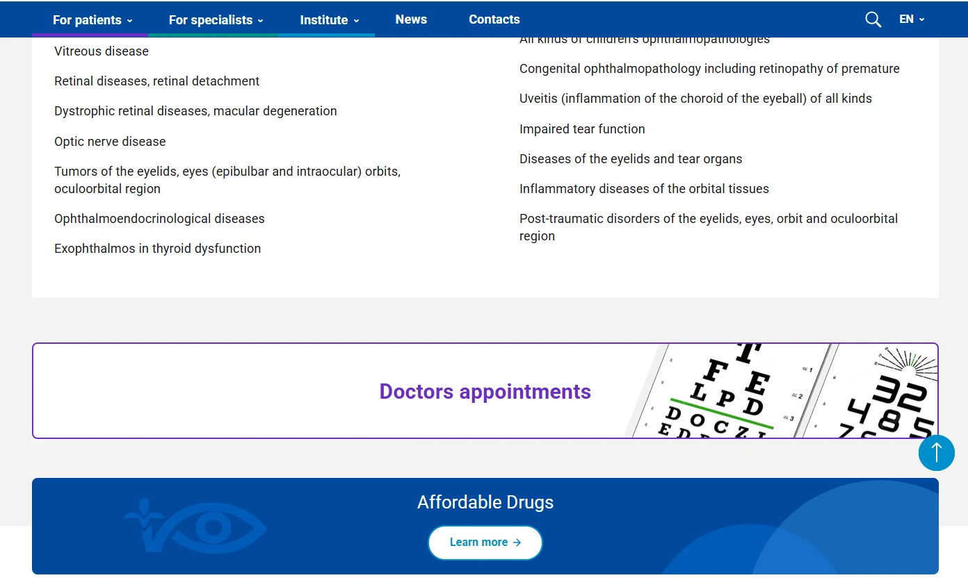
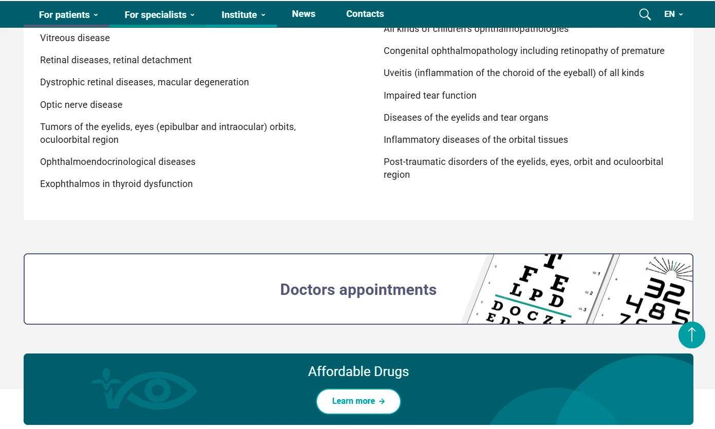
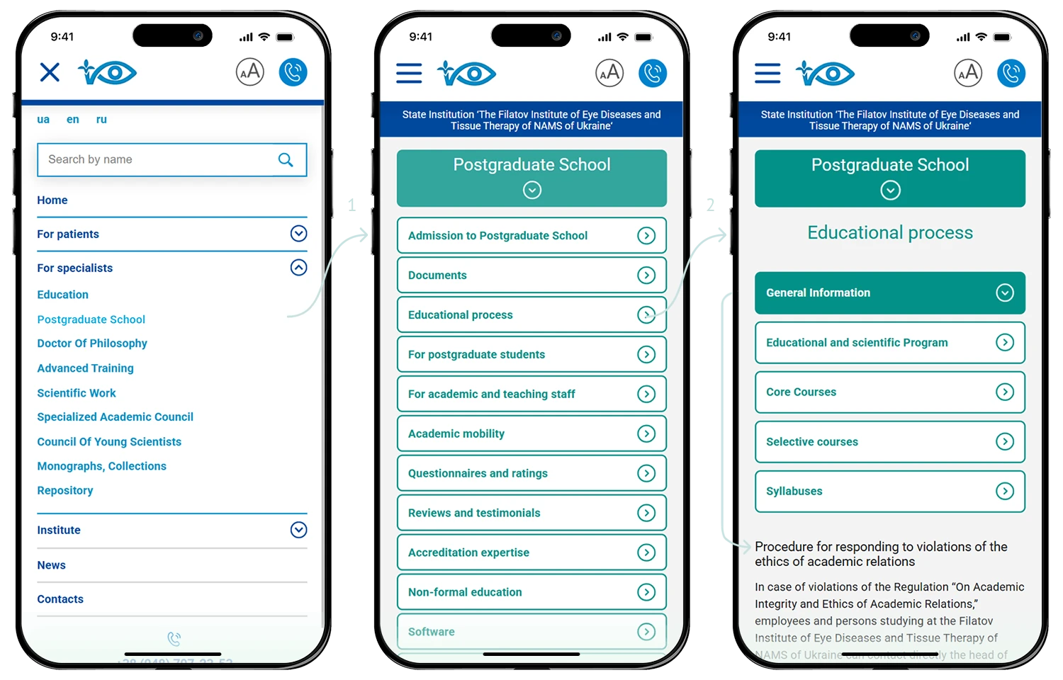
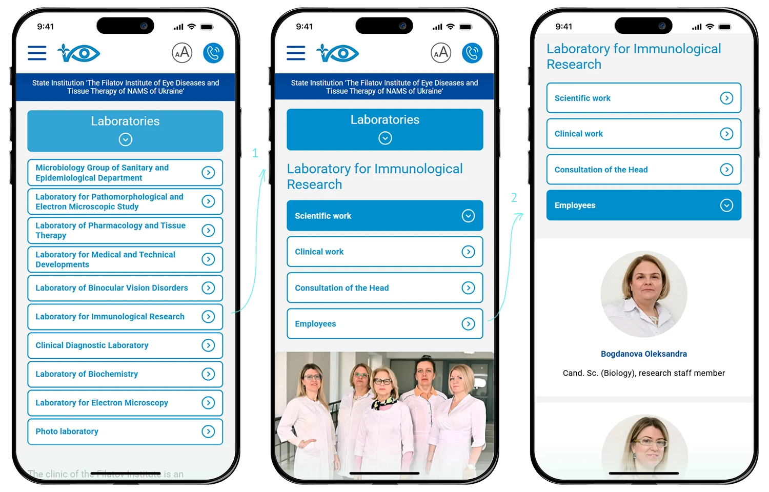
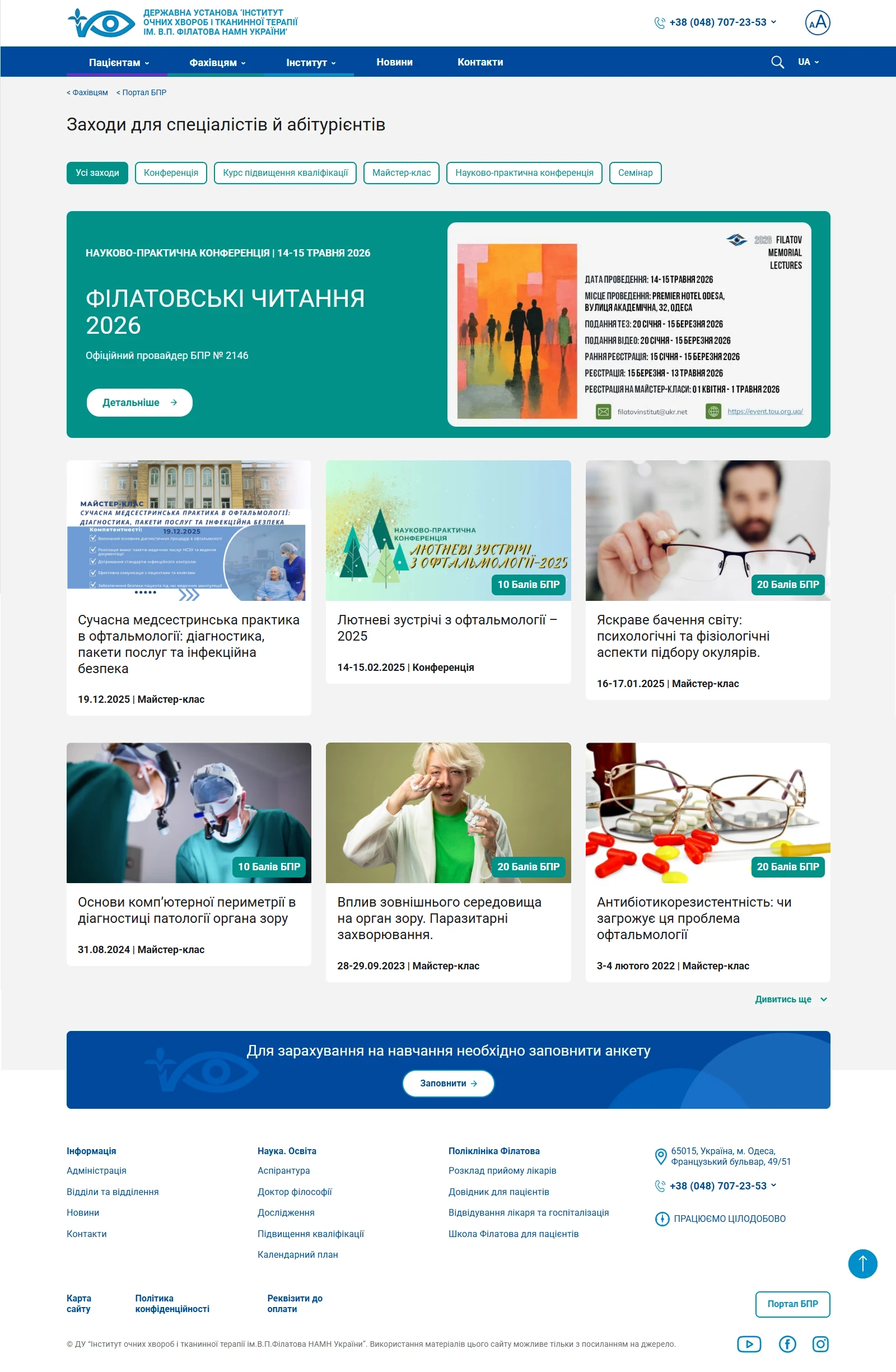
One System, Three Audiences
Patients, medical professionals, and researchers get separate sections with color-coded navigation — clear structure, no confusion.
Maximum Value, Real Budgets
Templated scalability and content strategy let us deliver 3x scope within 1x budget. Sustainability over one-off custom builds.
Design Solutions for Healthcare
Digital Platforms & Patient Tools
- Medical websites and patient portals
- Appointment and queue management systems
- AI chatbots for FAQs and appointment booking
- Accessibility-first interfaces
Brand Identity & Trust
- Medical brand identity and visual systems
- Multi-audience color-coding and navigation
- Communication strategy for public healthcare
- Patient education and information materials


Content & Education
- Medical journals and pharma publications
- Patient information and educational content
- Professional training materials
- Content strategy and website content filling


Accessibility & Inclusive Design
- Built-in contrast and readability (not plugins)
- One-click accessibility modes
- Color systems for vision-impaired patients
- Compliance with medical accessibility standards

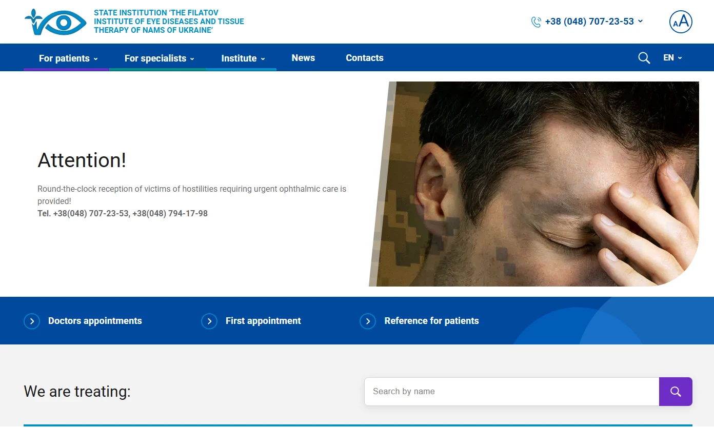
△ Case in practice v1.0
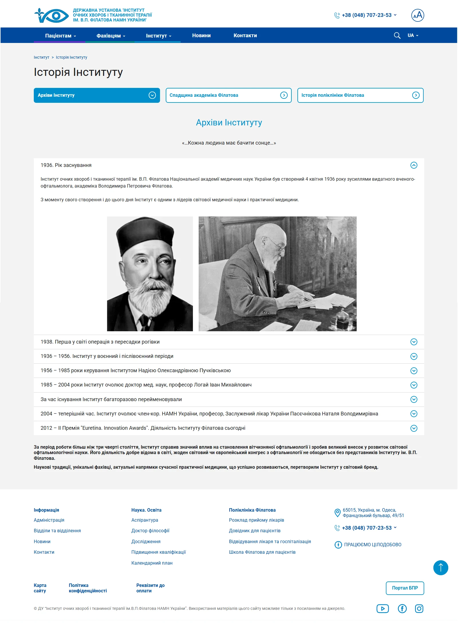
The Filatov Institute is one of the oldest ophthalmological institutions in Ukraine. Founded by the renowned surgeon Volodymyr Filatov, the institute has spent over 100 years combining treatment, science, education and international collaboration. Its activities include: clinical departments, clinical research, postgraduate studies (PhD & Doctoral),a scientific school, conferences, a library and a museum.
Over 4 years of partnership, we built a digital platform that connects patients, medical professionals, and academic research within a single, accessible ecosystem.
7/10
users rated readability positively
8/10
specialists locate the document they need on the first try
↑ 30%
organic traffic no paid promotion
4+
years of ongoing partnership — v2.0 in progress

Working process
Working documents
Personas, site structure, content mapping, wireframes — every decision starts on paper before it reaches the screen.
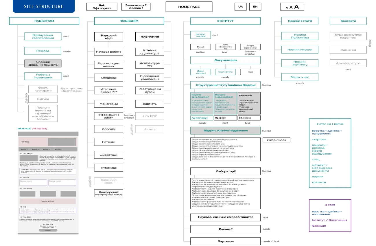
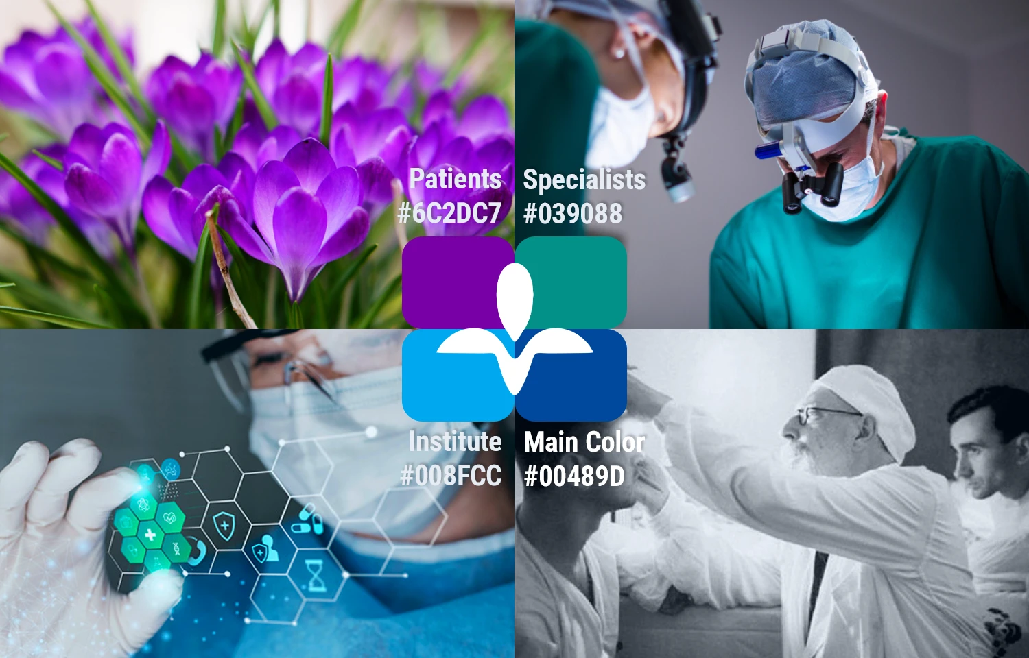
Three audiences, one system
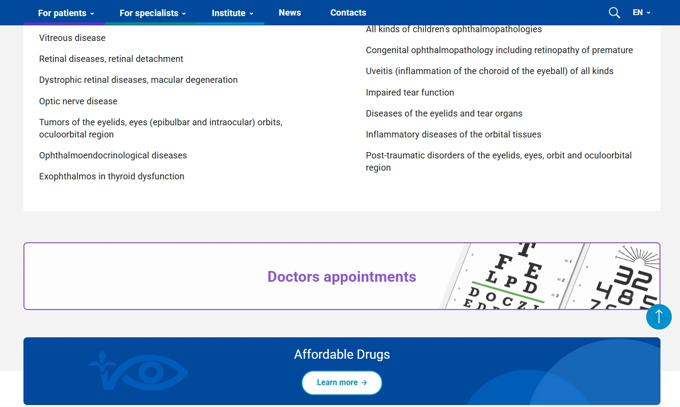
Patients, medical professionals, and researchers need completely different information — so we gave each group its own section with independent navigation.
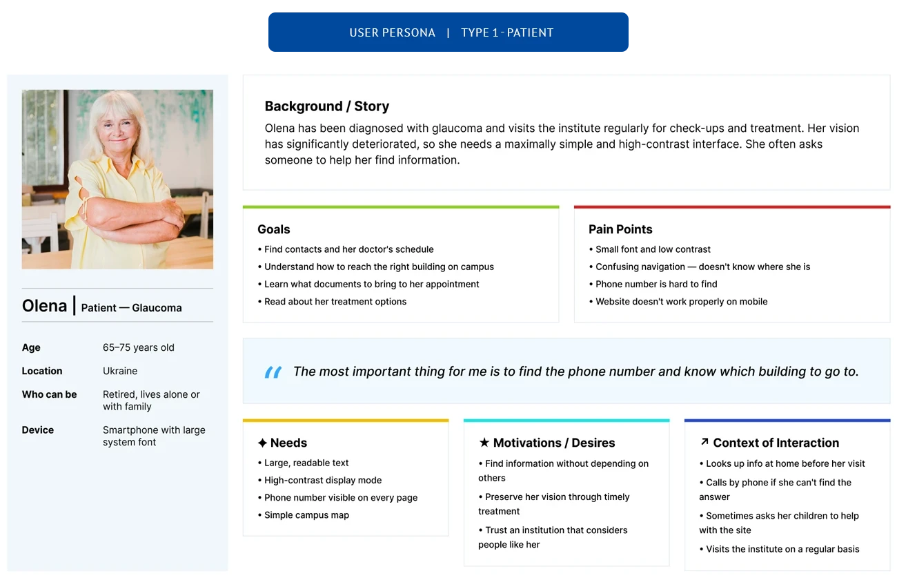
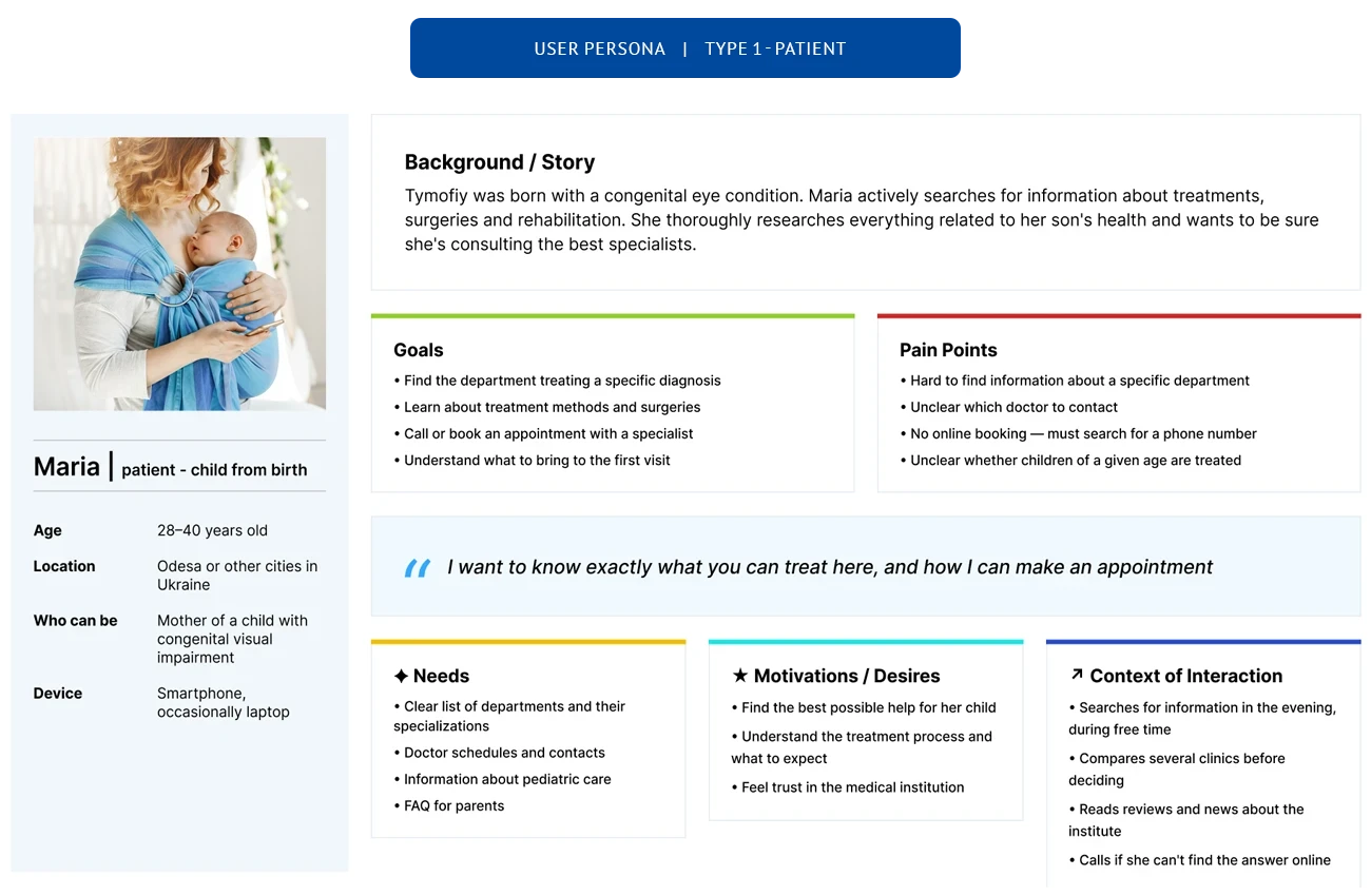
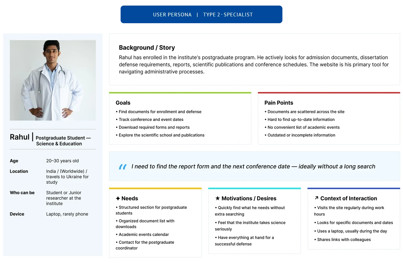
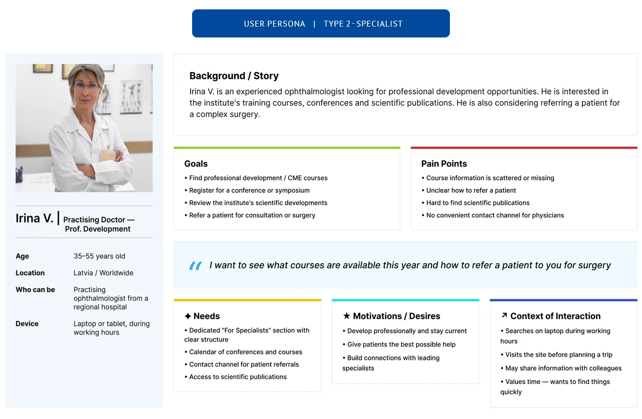
Colour wasn't decorative. Purple for patients — it remains distinguishable across the widest range of vision conditions. Teal for professionals — the colour of medical workwear, immediately familiar to staff. Blue for the institute — the original institutional colour, carried into the academic and research section.
Each section stands alone. Patients find appointments without wading through PhD archives. Researchers aren't distracted by intake forms.
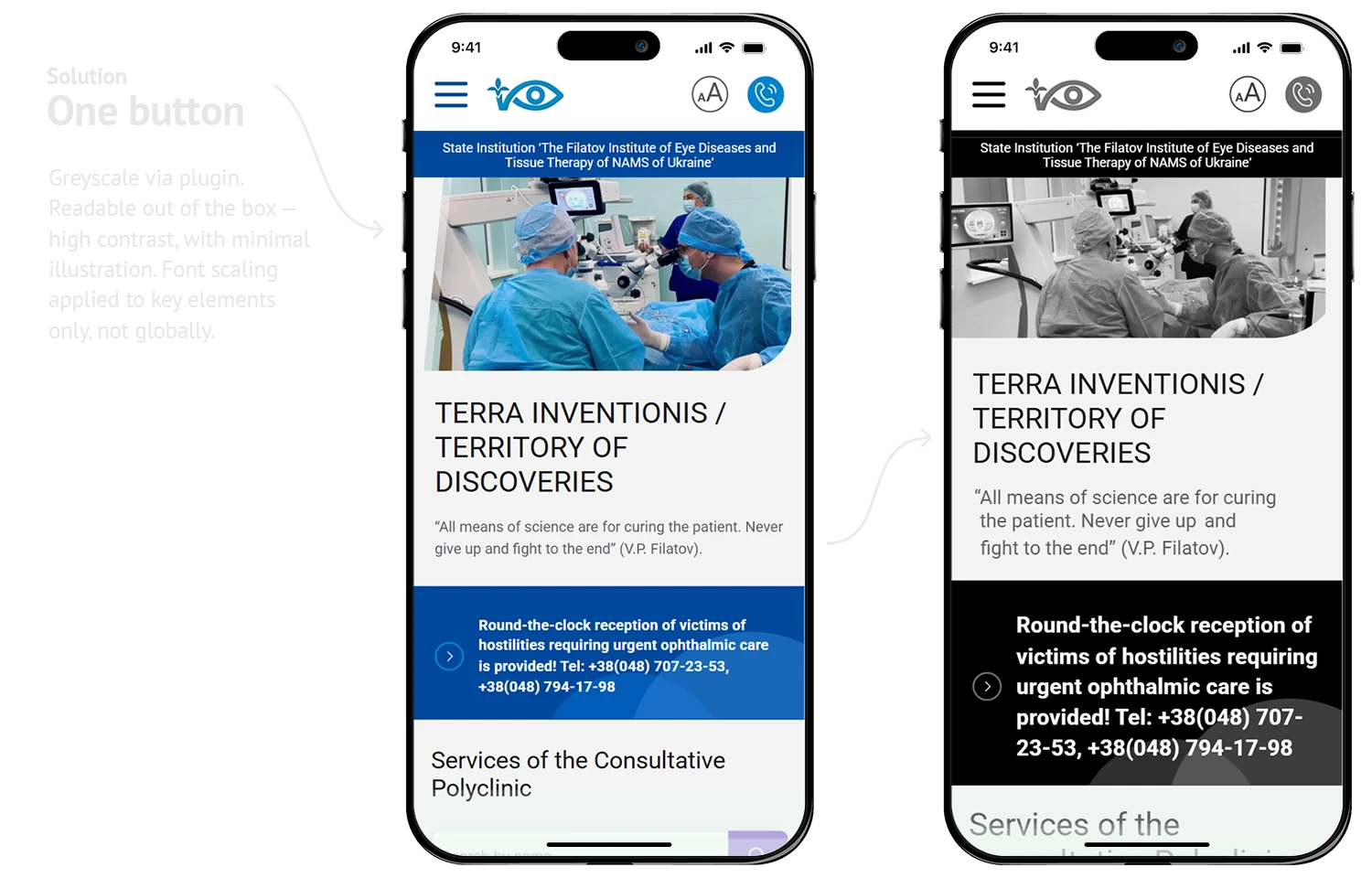
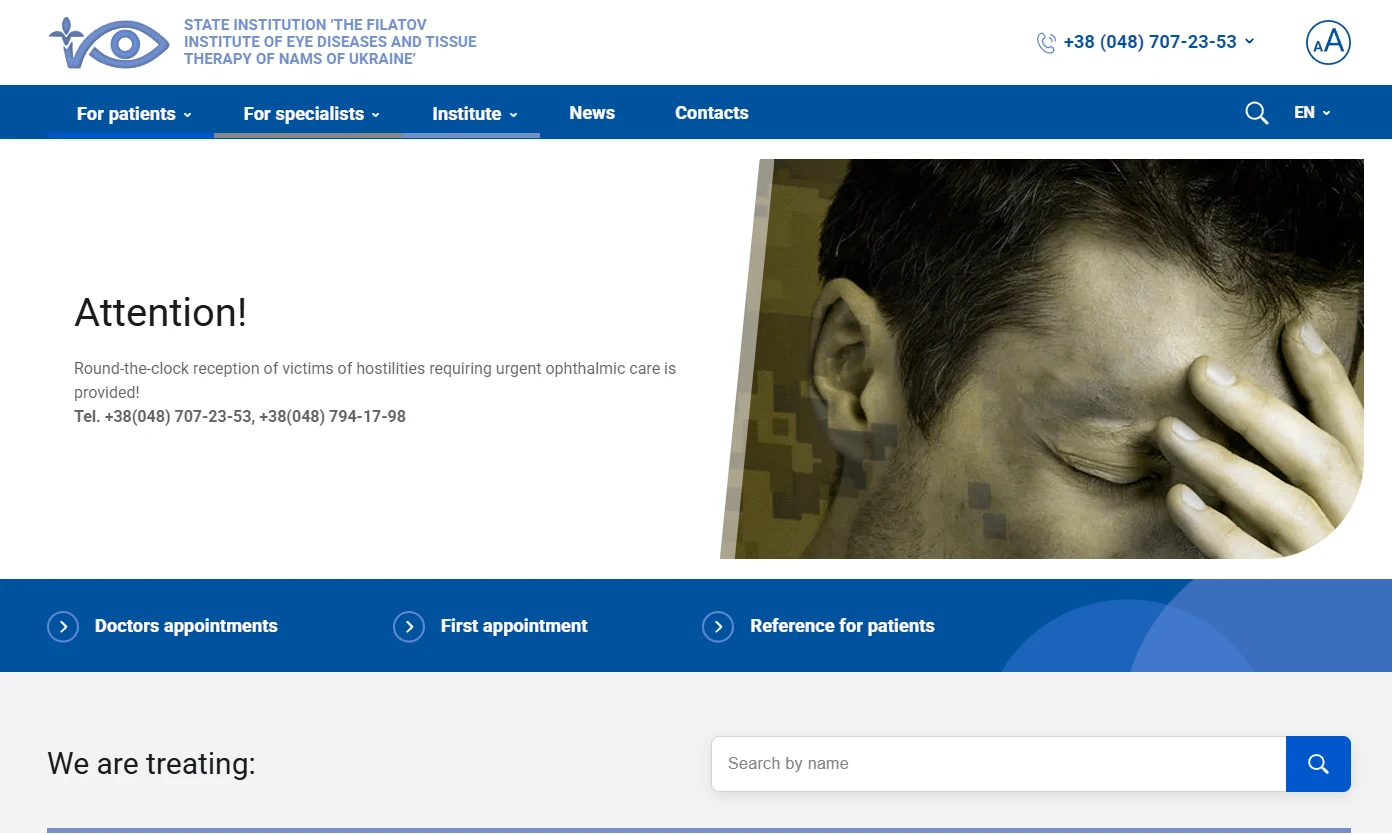
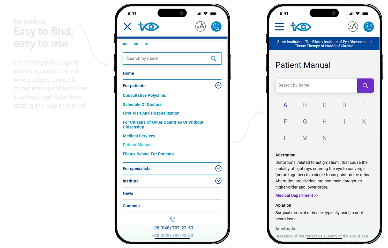
Accessibility
We didn't install a plugin. We made the site readable from the start.
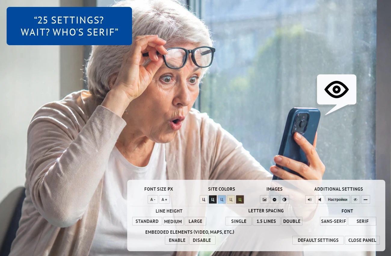
The common approach: A plugin with 10+ controls.
Font size slider, contrast picker, spacing adjuster, animation toggle, cursor modifier — a person with poor vision can't navigate this labyrinth.
We took a different route. Contrast and readability are built into the base design — the site works at default settings. The only addition is an Aa icon in the header: one click switches to large text and black-and-white contrast. Nothing else to configure.
What an initial user survey showed:
7/10
won't use on-site accessibility settings at all
9/10
with poor vision increase font size at the device or OS level
2/10
have colour perception issues — respond well to b&w with strong contrast
The takeaway: people don't configure the site — they configure their device. Our job isn't to offer settings. It's to make sure a visually impaired patient finds a doctor's contact in 10 seconds, not 10 minutes.
Version 2.0 note: The first release gave us real usage data. With those numbers in hand, the accessibility approach will be revisited in v2.0 — refined based on actual user behaviour, not assumptions.
Vision simulations
We tested across common visual impairments — blur, contrast loss, colour deficiency. The site remains navigable and readable in every case. A patient with seriously compromised vision can still find a phone number, a building, a doctor. Early user feedback reflects this: 7 out of 10 rated the site's readability positively.
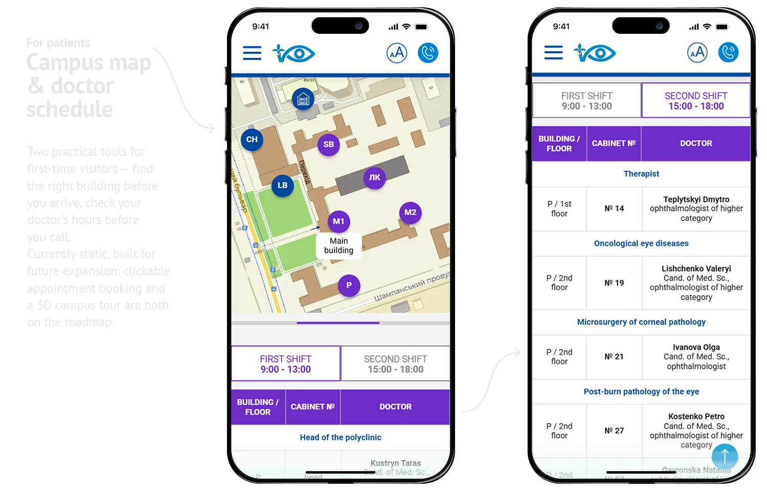
Small additions, big impact
A government institution with decades of history means a sprawling campus — multiple buildings, long corridors, departments spread across the grounds. Reception is a single desk handling the entire site. Patients arrive, often already anxious, unsure which building to go to or who to ask.
We added an interactive campus map with building locations and a department schedule showing room numbers and contact details. Patients can check exactly where to go before they arrive — without needing to find someone to ask.
Small additions. But for someone navigating an unfamiliar medical campus alone, they matter.
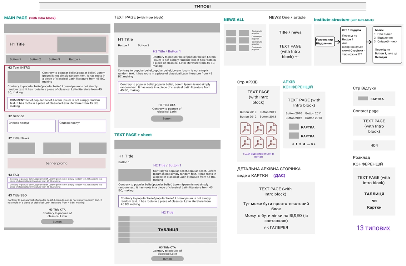
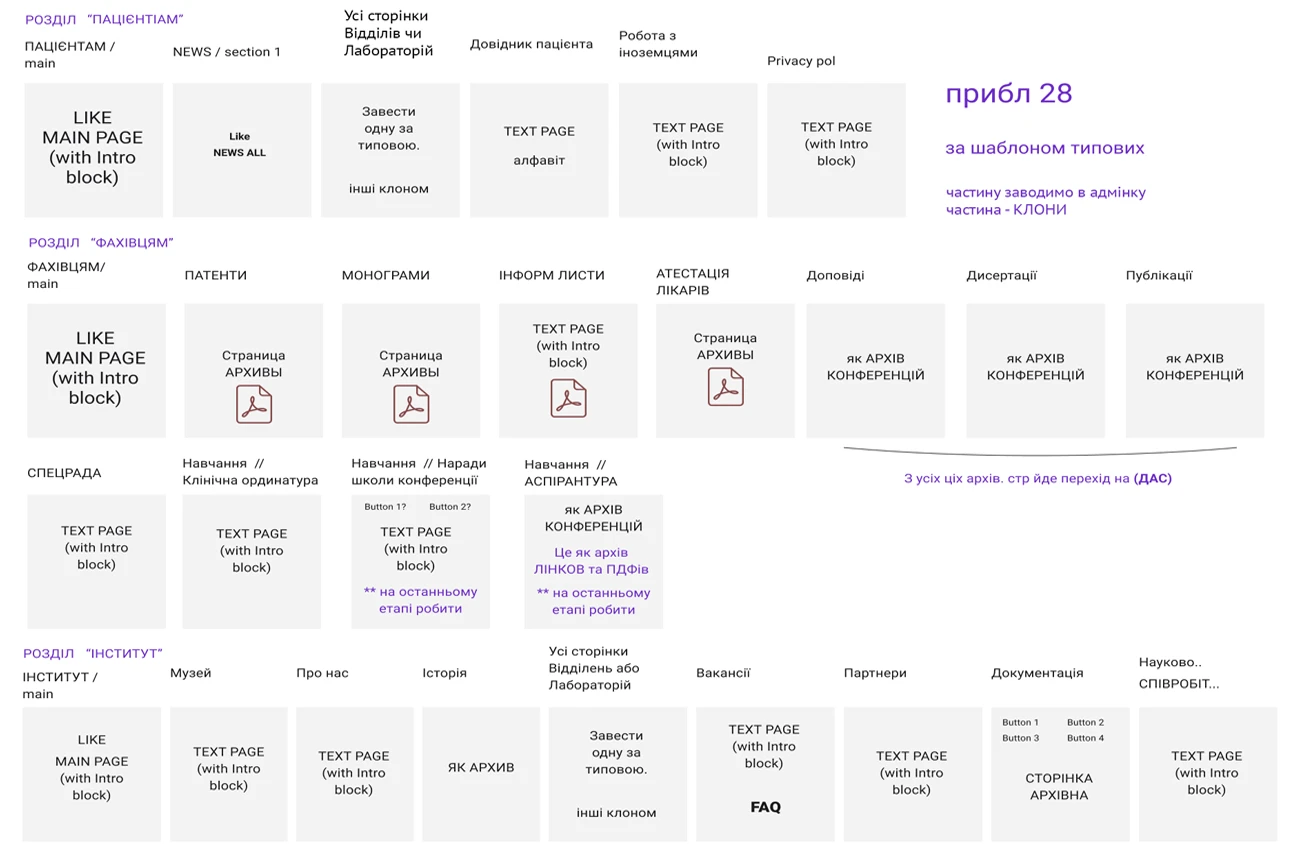
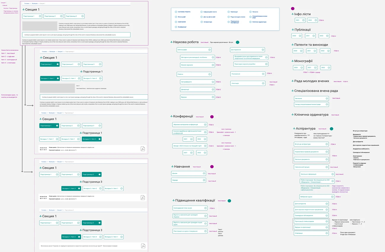
Built to scale
Reusable templates — department profiles, doctor cards, service pages, news — keep the structure consistent as the site grows. The admin panel lets institute staff add and update content independently, no developer needed. Four levels of navigation handle complex information without losing the user along the way.
From structure to content
We didn't just design pages — we structured content, wrote copy, and filled the site. For a government institution with limited marketing resources and overloaded medical staff, this meant the platform launched complete, not as an empty shell waiting for someone to find time.
The site is still being filled — medical content takes years to migrate and organize. But the foundation is solid, and the institute team knows how to scale it.
Beyond one project
Our healthcare work extends beyond this institute. We've redesigned platforms for maternity hospitals (working with legacy code and complex admin systems), produced pharma publications and educational materials, and helped medical facilities adapt during extremely challenging times — including wartime conditions when clear, accessible communication became critical for patient safety.
Each project reinforces the same principle: healthcare digital systems must prioritize clarity, accessibility, and resilience over visual trends.

Academic and research institutions don't need aggressive promotion — they grow through trust, word of mouth, and the value of their content. Their communities are built through conferences, lectures, published research, and the continuous exchange of knowledge within academic platforms and events. The Filatov Institute is exactly that kind of place — where treatment, education, and science coexist within a strong, self-sustaining ecosystem. What it needed wasn't online visibility. It needed a platform worthy of its audience — one we continue to grow and evolve.
Figma
Adobe Photoshop
Adobe Illustrator
ChatGPT
VS Code
WordPress
HTML / CSS
JavaScript
GitHub
Google Analytics
Hotjar
Google Colab
Ready to build accessible, scalable healthcare platforms?
We design medical digital ecosystems that work for real users and real budgets. Let's discuss your case.
Start a dialogue